

NBC Universal - E!News
PRX Design System
PRX Design System is a set of standards, UI patterns, and reusable components that adhere to Atomic Design Methodologies. Championed by designers and developers to help streamline workflows for the E! News digital product teams and editorial team.
my role
Product Designer
Design System Manager, Component Design, Branding, Visual Design & Wireframing
platform
Web, iOS, Android
tools
Sketch, Invision, Invision DSM
team
1 Visual Product Designer, 1 Senior User Experience Designer, 1 Visual Designer, 2 Web Developers, 1 Director of Product, 1 VP of Product
Problem
Short deadlines and inefficient internal processes.
Multiple designers recreating UI patterns from scratch with limited visibility to other project verticals and any possible pre-existing designs
Designers focused on waterfall review process and creating full page comps and creating more instances
Time wasted with more meetings needed because of design to developer disparity
Inconsistent representation of brand UI
Values
Flexible
Concise
Efficient
Goals
Single source of truth.
Create a design system to be the source of truth that designers, developers, product managers, and stakeholders can reference
Reduce stakeholder review time by focusing on components rather than comps
Foster a cohesive designer-developer relationship with a shared language
Build trust with end-users by creating brand consistency(reusing components) and creating a strong visual narrative

Everybody deals with constraints
Low resources
The few developers on the team were stretched thin by the deadlines for the overall project and therefore we could not create a Design System from scratch also only had 2 designers focused on this initiative preferences.
Learning curve
Previous designers on the project had left without any onboarding to what was established and I had never used Invision DSM. I had to learn a new tool, which was a challenge I gladly took.
Existing design tools
We had an existing established toolbox of Sketch and Invision DSM-which was being underutilized-and would have been cut with budget constraints, had I not championed the need and value for it
Design Approach
Atomic Design Principles
Atomic design is methodology for creating design systems


molecules
Components: Buttons, tags, text links, icons, dropdowns, tabs; navigation bar, footer, search bar, pagination
atoms
Foundations: Bulma grid, spacing, font, text styles, colors, object styles


templates
CMS: Page Layout Templates - Homepage, Landing Pages, Content Detail Pages
organisms
Components: “Widgets” - Hero, List, Grid, Carousel, Gallery, Video
My Tasks
Auditing current UI patterns and consolidating redundancies
Facilitating design to dev and design to marketing sessions to understand more clearly their needs and defining solutions for naming conventions and interpreting style guides
Creating a new sketch library with symbols that integrated with Invision DSM and inspect
Collaborated with Lead UX designer and pulled established grid and spacing documentation from earlier developer sessions
system implementation
Foundations:
Atoms
grid + spacing
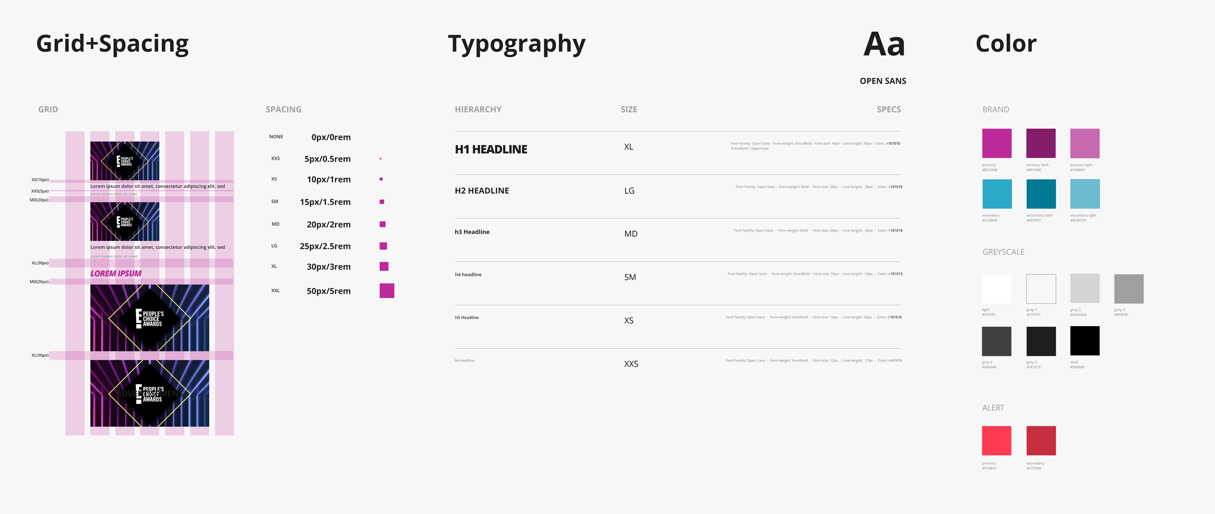
12 column Bulma grid base with breakpoints at 320px, 768px, and 1024
Established vertical rythm(specifications between content vertically) with sizing definitions to give flexibility of change
typography
Used only the font family Open Sans
To have better optimization - used 6 main header styles across the whole site - using a sizing system to keep flexibility for overall text style changes
colors
Colors are broken down between brand, greyscale, and system(alert)
Used brand colors to tell visual narrative - reserving these colors to signify action or highlighting an area
system implementation
Components:
Molecules
buttons
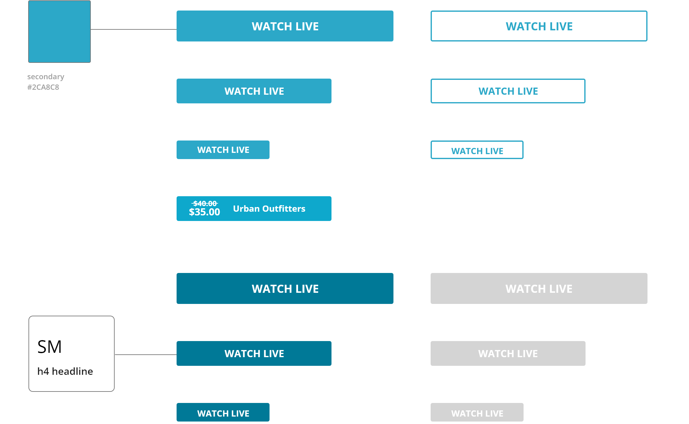
Created a button set based on primary, secondary, hover and disabled states
Most interactable elements were denoted with the secondary color to display high contrast with visual narrative
icons
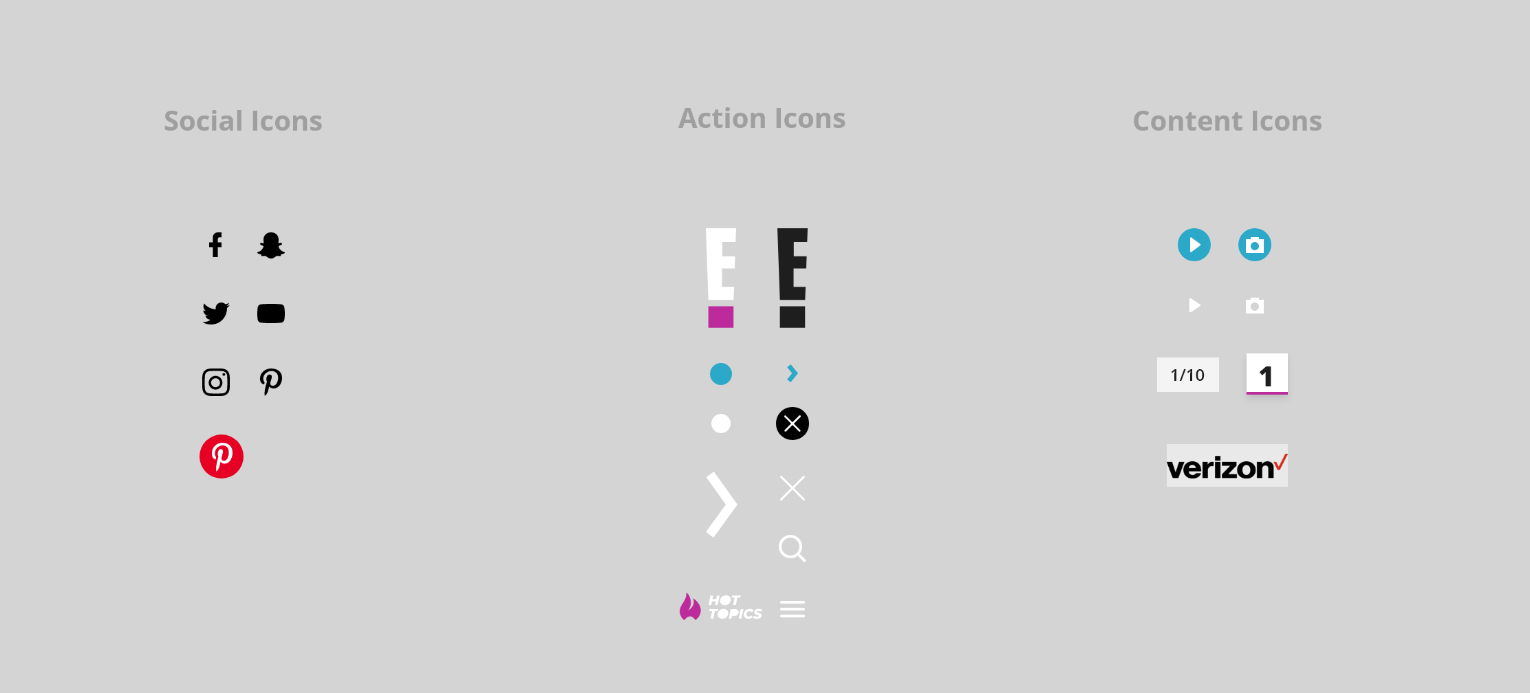
Each icon was bucketed into sections related to their meaning
Action and content icons were more global terms because they touched multiple components
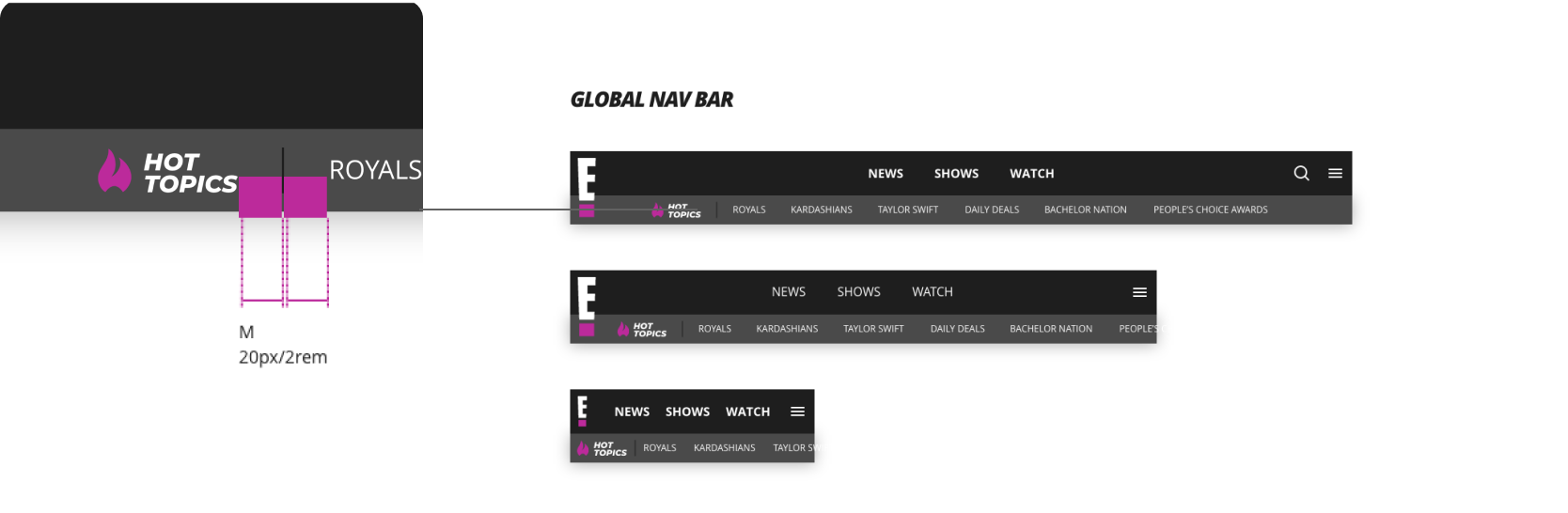
navigation
The primary brand color is mainly used in high traffic areas such as the navigation bar
Used Medium spacing in between all horizontal navigational elements
system implementation
Widgets: Organisms
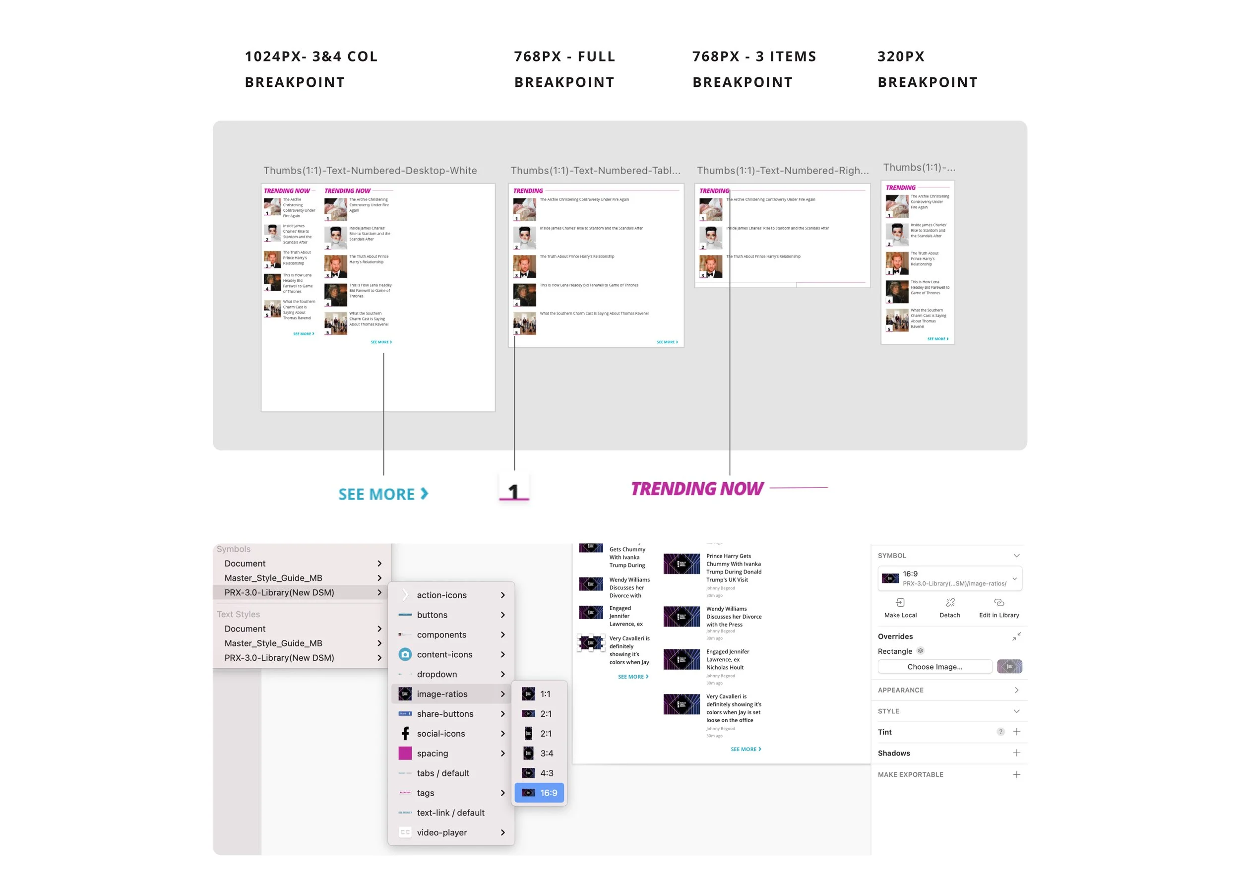
components used in widgets
Widgets aka Organisms - were based off of editorial workflow and were combined componenets that allowed flexibility on the page for editors
12 column grid
Used the 12 column grid to dictate the layout sizes for each widget - this was mainly focused on desktop (stakeholder choice)
Sketch file
Sketch libraries were used to maintain the component stucture
Libraries allowed quick access to well used components throughout the site and made mocking up comps much quicker
system implementation
Layout Page:
Templates | Front-End
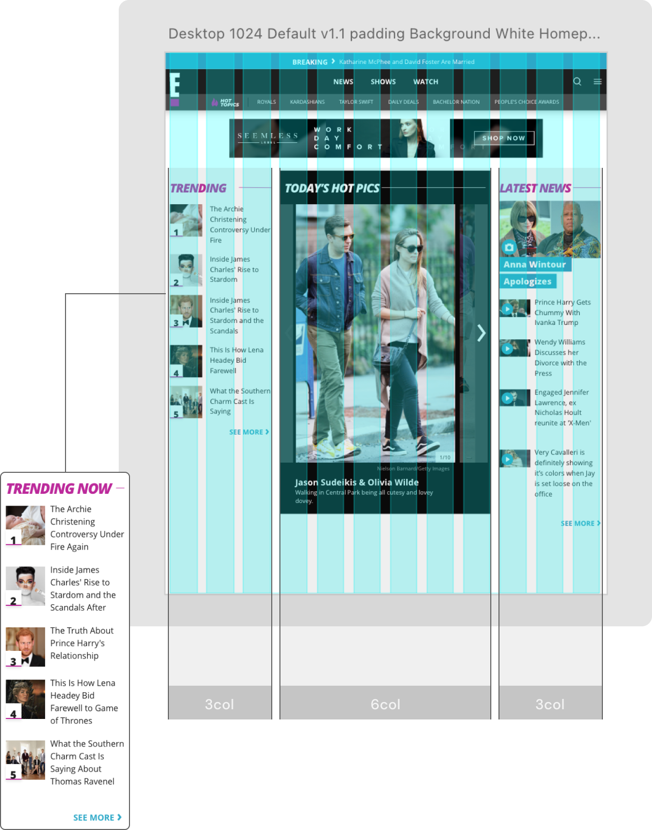
PLT
Page Layout Templates refers to the set “highly used” layouts that both the UX designer and I came to the conclusion with
These set templates allowed quick access for editors to publish their content
CMS
The main idea here is to show the holistic view of what these widgets were used for and the more efficient way of marrying the product in the back-end with the front-end
system implementation
CMS - PLT:
Templates | Back-End
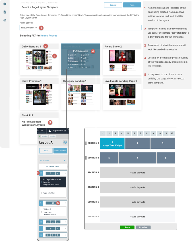
grid+widgets
Displayed is the front-end view of widgets being layed out on a grid
This is the main homepage template with 3-6-3 column view
flex-box
With the amount of variability of the content- everything was laid out using React components and flexbox technology
This was to optimize viewports and the amount of text style variability
system implementation
Impact
20% Better turnaround times for designers and developers
17% Less time with stakeholder reviews (already approved components)
Improved communication for digital product and editorial team
Brand consistency
We won an award!